IDEX Online Research: U.S. Jewelry Industry Now A $65 Billion Enterprise (Full Analysis)
August 21, 11
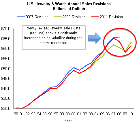
(IDEX Online) – The U.S. Commerce Department continually tweaks its retail sales data. Monthly data is amended every 30 days or so for up to six months after its initial report. Then, each year, the Commerce Department revises its annual sales data. Most of the revisions are modest; occasionally, the revisions are major. We’d characterize this year’s data revision as “major,” if for no other reason than the industry grew – at least on paper – to $65.3 billion in annual sales at its peak in 2007, up from a previously reported $62 billion.
Here’s what is most interesting about the newly revised 2011 data: it is nearly the same sales level as reported four years ago – at the end of 2007 – of $65.5 billion. An interim revision in 2009 had reduced 2007’s jewelry industry sales peak to $62.0 billion; now, the industry size has been restored to its former level of $65 billion.
How does this happen? Jewelry industry sales are estimated by the government, using several different sources. Jewelry sales made by specialty jewelers are the most reliable portion of the estimate, since they are reported by a separate retail sales code. However, jewelry sales by other merchants are less reliable, since jewelry merchandise is often aggregated in broad retail categories such as “fashion accessories.” Using sampling techniques, the Commerce Department attempts to segment a retailer’s “fashion accessory” sales into categories such as “sunglasses,” “scarves,” “jewelry,” and other fashion categories.
Further, retail sales reports during the 2008-'09 recession were sometimes muddled. Retailers did not pay as much attention to the government requests for more information. In the vernacular, “garbage in, garbage out.”
The Commerce Department’s latest data revision is an attempt to dump the “garbage” and restore integrity to its data.
Jewelry Sales Peak Up, Recession Dip Lower
The revised jewelry sales data shows that
The graph below shows jewelry sales based on the most recent three major data revisions by the Commerce Department. The red line is the latest data, while the green line represents sales that flowed from the major 2009 revision and subsequent data. The blue line shows jewelry sales that the government had reported prior to 2008.
 Source: US Commerce Department |
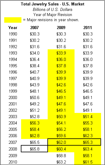
The table below summarizes the data shown on the graph above. The cells highlighted in yellow show data that has been revised. Here’s how to interpret the yellow highlighted data:
· In the first column “2007,” the Commerce Department revised 2004-2006 data during 2007. When final 2007 and 2008 sales were reported, the data from the 2007 revision were unchanged; hence, we showed them in the “2007” column, even though they were reported after the 2007 data revision.
· The largest revision occurred in 2009, when data from 1993 through 2008 were revised significantly, as shown by the yellow cells on the table.
· The most recent data revision, shown as “2011” on the table, reported new data from 2003 through 2010.
· The cells shown in the box are the peak years for jewelry sales, as reported by the Commerce Department.
 Source: US Commerce Department |
Jewelry Sales More Volatile Than Watch Sales
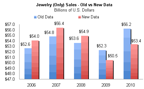
The largest adjustments were made to jewelry (only) sales. In 2007, they were higher than previously reported, but in 2009 and 2010, jewelry (only) sales were less than prior data indicated, as the graph below illustrates. The revised data is represented by the red columns.
 Source: US Commerce Department |
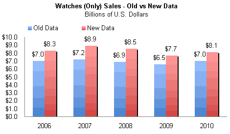
Revised watch (only) sales were greater in every year than had been previously reported, as the graph below illustrates. The red columns represent revised watch (only) sales data.
 Source: US Commerce Department |
While all of this data revision may seem mind-boggling, here’s the good news: broad fundamental trends have been unchanged over all of the many revisions. In short, jewelry sales suffer when economic growth slows, and jewelry sales generally perk up significantly in an economic recovery period.
Jewelry Sales Are Coincident Economic Indicator
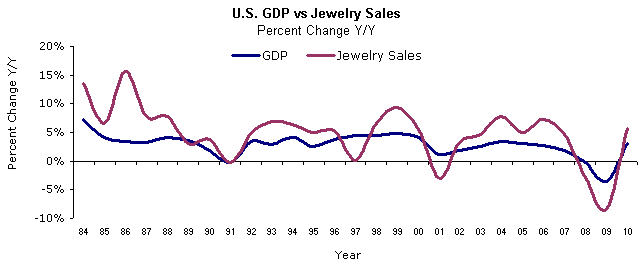
Many people in the jewelry industry claim that
The graph below compares economic cycles – based on real Gross Domestic Product – with jewelry sales since 1984. If we believe that jewelry sales portend a recession, the graph confirms that jewelry sales predicted at least two – or more – recessions that never occurred.
 Source: US Commerce Department & JIRI |
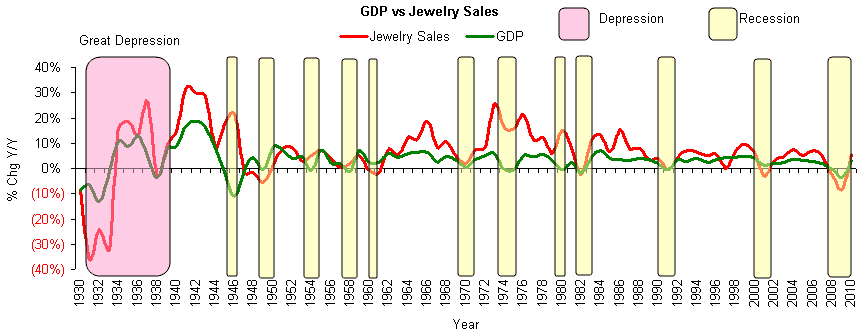
The graph below summarizes jewelry sales, economic cycles, and recessions since the Great Depression in 1929. Once again, it is apparent that jewelry sales levels are more volatile than economic cyclicality. However, they broadly follow the same trends.
 Source: US Commerce Department & JIRI |
Watch Sales Mix Rises
New data from the Department of Commerce shows two key trends about watch sales:
· Watch sales are growing faster than jewelry sales.
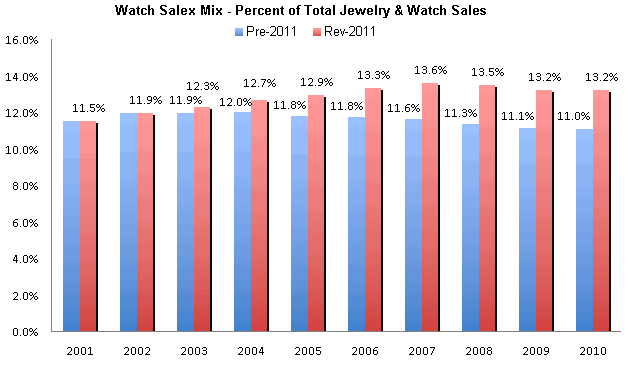
· The watch sales mix has grown from just over 11% of total
We believe that fashion watches are responsible for much of the growth of the watch business over the past ten years or so. In addition, sales from high-ticket watches have also pushed total watch industry revenues higher.
The graph below shows the watch sales mix based on earlier data (blue columns) versus the watch sales mix based on newly revised figures (red columns).
 Source: US Commerce Department |
Specialty Jewelers’ Importance Continues to Decline
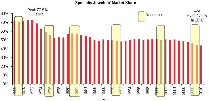
Each revision of jewelry sales shows one inescapable trend: specialty jewelers are losing market share to other merchants who sell jewelry. Worse, specialty jewelers lose market share consistently during a recession, and they never regain that market share in the post-recession period.
The graph below summarizes specialty jewelers’ sales as a percentage of total
 Source: NBER, BLS, JIRI & US Commerce Department |
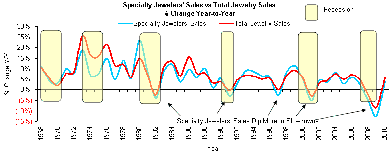
Further, specialty jewelers’ sales tend to be slightly more volatile than jewelry sales of other merchants, as the graph below illustrates.
 Source: NBER, BLS, JIRI & US Commerce Department |
Jewelry Share of Wallet Relatively Unchanged
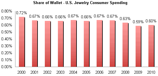
Jewelry’s share of wallet for the typical American household was 0.60% (six tenths of one percent) during 2010, based on revised data from the Commerce Department. Based on earlier data, jewelry’s share of wallet had been about 0.61%. This is an inconsequential difference.
Here’s what is important: jewelry’s share of wallet has been declining for the past decade. At the beginning of the decade, it was 0.72%. It fell as low as 0.59% during the recession, but bounced back modestly in 2010.
The graph below summarizes the trend in jewelry’s share of wallet of the typical American household.
 Source: US Commerce Department |
American shoppers consume just under half of all jewelry sold in the global market. Global jewelry sales data is fuzzy at best, but we believe that 2010 global jewelry sales were in the range of $145 billion. Thus,
Revised Jewelry Sales Forecast Forthcoming
Based on Commerce Department forecasts, 2011 is expected to be a record year for the
Our full forecast will be forthcoming soon.